
Seasonal Color Theory
If you’ve ever wondered how important color is to your brand then I encourage you to sit for a moment and think about each individual color.
Red..orange..yellow..green..blue..violet..pink..white..black..brown..
As you are thinking about these colors, what are you feeling? What images come to mind?
Now, take a moment and really listen to your body.
Do you feel more tense, more relaxed, more energized as each color passes through your mind’s eye?
Color has the power to make us feel.
And when it comes to your branding, how your brand makes people feel is everything.
You’ve done the work. You know what sets you apart from your competition. You’ve created a sacred business that is yours.
Now you need to create an identity for your brand that makes your ideal client feel all the right things about your business.
So, let’s talk color.
Where color becomes unique is in the way you use the color. Each color has the ability to contain a positive effect or a negative effect and combinations of colors can also give a completely different feel.
The first and often easiest way to begin determining what colors you should use is by using seasonal color theory to determine your brand’s color season.
Seasonal color theory is essentially matching your brand to one of the four seasons in color psychology that each have their own color palettes, tones, textures, and aesthetics that help guide you to represent your brand with the most impact.
Don’t worry- it sounds more complex than it is, and I even created a simple quiz to help you determine your season!
The Quiz
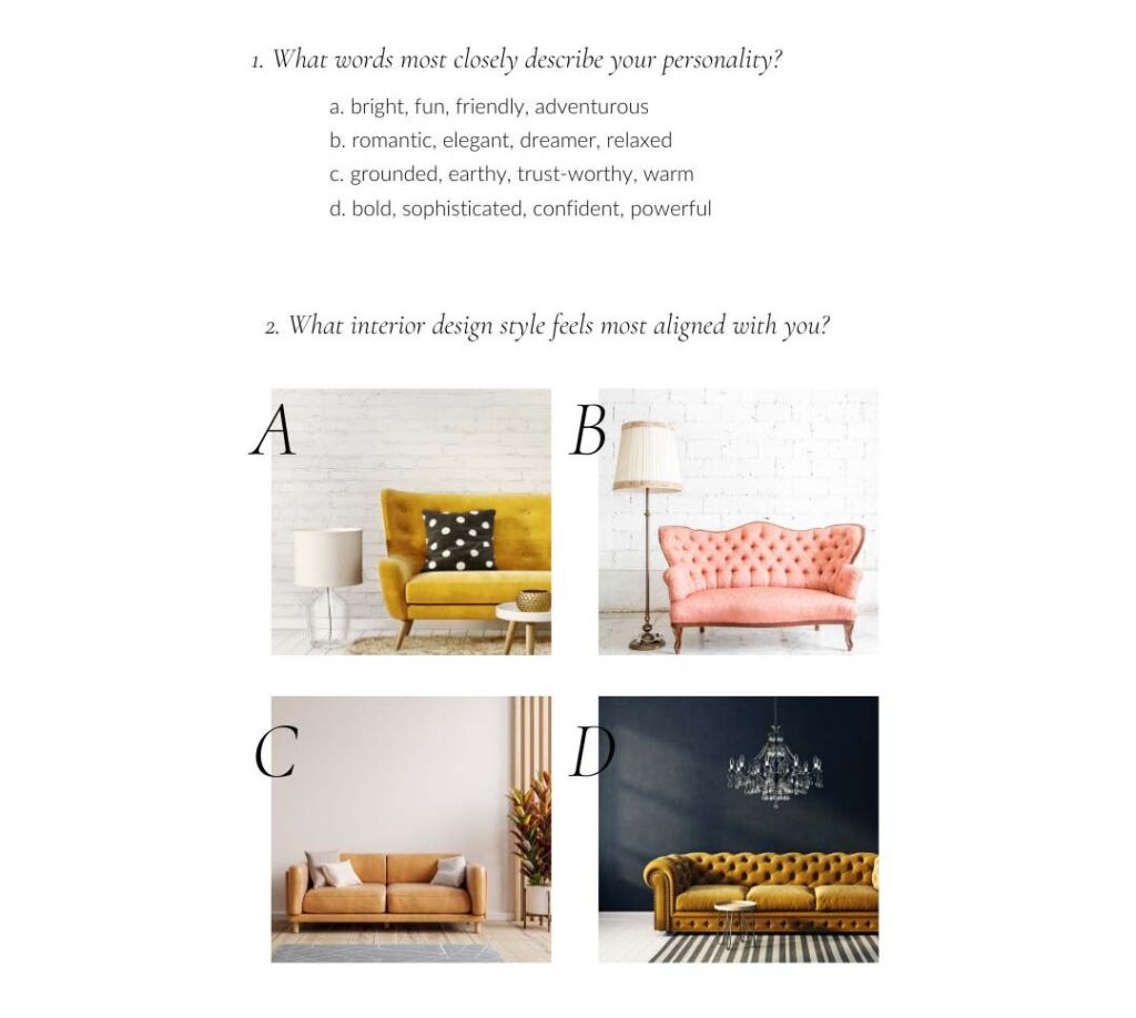
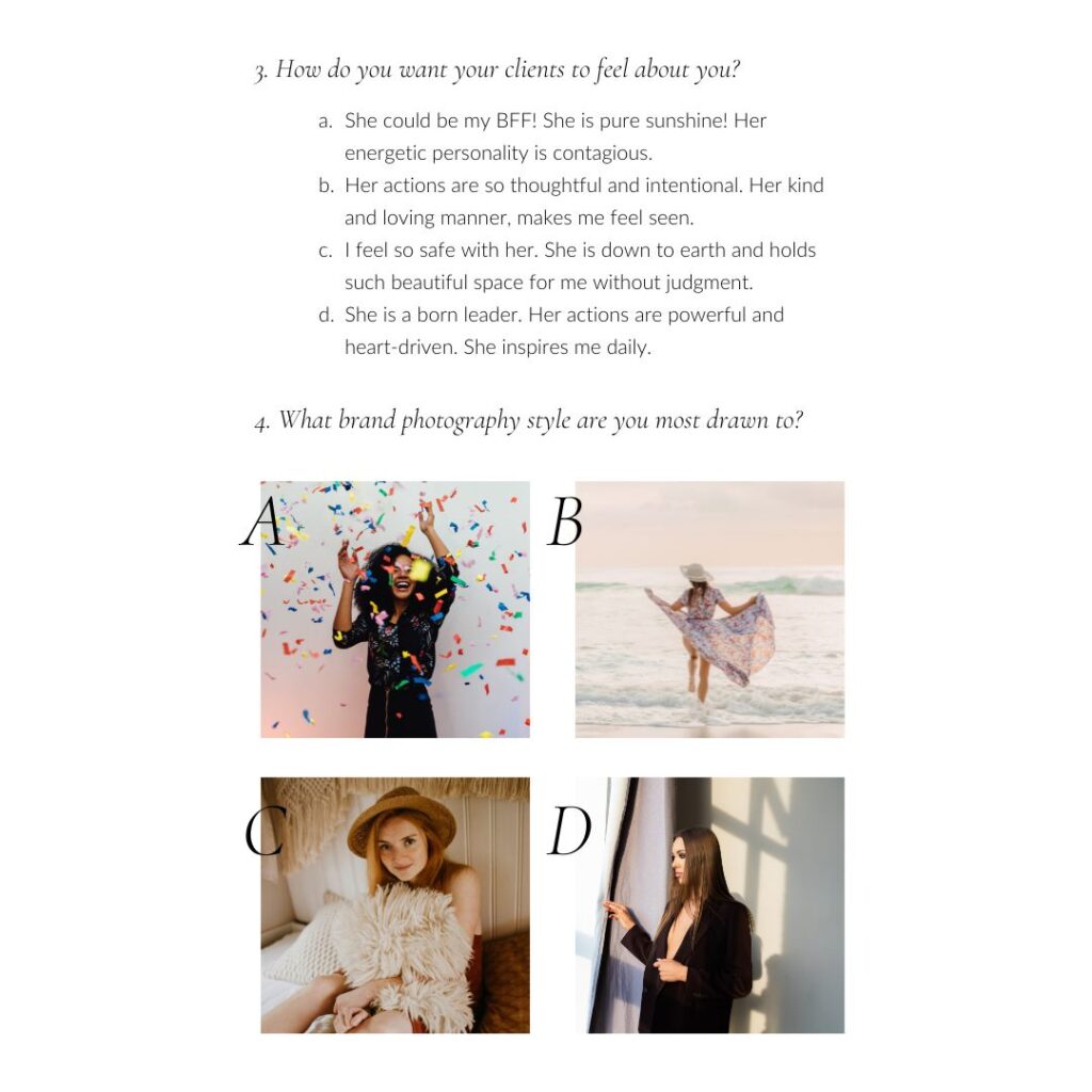
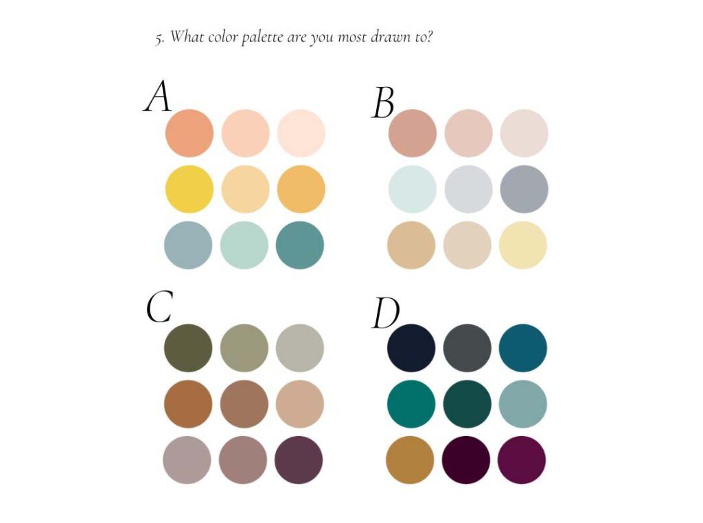
Spring Brand Season (mostly As)
Spring brands are warm and approachable, bursting with creative, fun, and youthful energy. Think of them as that friend of yours that is always happy and bubbly and being around them just brings light and happiness into your day. Their color palettes are light and bright, full of warm colors that are slightly muted in intensity. No bold reds here. For fonts you will want to stick to anything that is lighthearted and fun. Playful, flirty scripts or handwritten fonts, as well as clean, light-weight, sans-serifs.
Summer Brand Season (mostly Bs)
Summer brands are romantic, elegant, and graceful. Think Romeo and Juliet. They are caring, yet organized and they produce quality. They are timeless and also intuitive. Their color palette consists of delicate, cool, and muted colors as most colors are softened with a touch of gray. For fonts, you will want to stick to quality, traditional Serif typefaces and flowing script fonts as these can draw in the romantic aspects.
Autumn Brand Season (mostly Cs)
Autumn brands are raw, Earthy, natural, and warm. Think literally Mother Earth herself or your best boho goddess. She’s passionate, engaging, informal yet compassionate. A little bit of a rustic vibe. Her color palette is warm and intense, but yet muted. Most colors can be found in the natural world around us. Many fonts represent the Autumn brand season however Serifs and impact fonts with texture and personality work especially well.
Winter Brand Season (mostly Ds)
Winter brands are dramatic, compelling, luxurious, and even mysterious. They are your grounded minimalists. Your leaders. They show up as the expert and they demand your attention. Their color palette consists of bright intense colors with a cool edge, each clear and crisp. Luxurious serifs or sans serif fonts work best for this brand season.
So let me ask, what season is your brand?


